
How to visualize GSC data Month-wise using Google DataStudio?
GSC daily trend graph can be confusing sometimes

I was doing some analysis the other day and saw a negative trend on one of my websites in Google Search Console. Probably because of the Page experience update.
It was becoming difficult to read that data because of the daily trend GSC shows.
And I wanted to measure the month-wise drop rate.
So first I decided to export the data in an Excel sheet > Convert all dates to months > and then visualize it month-wise.
But then I realized there is a better way which is even faster!
Google DataStudio!!
I connect GSC to GDS and visualized the data month-wise and then exported the Excel.
Let me show you how it’s done.
Connect your Google Search Console property to Google Data Studio. Make sure it is a URL impression table.

Once you are done connecting the Search Console, click on “Add to chart” and select “Column chart”

Select “Date” in the Dimension

Edit the “Date” dimension by clicking on this small edit button -

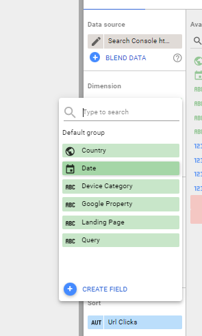
Then click on “Type” and change it to “Year Month”


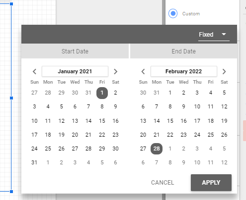
Scroll down to the “Date range” section on the right panel, change the date to Custom and select whatever date range you want. I am selecting “Fixed” on 1st January 2021.

Now hitting on Apply gives us this chart -

You can move down to the “Sort” section and change it to “Date” - Ascending -

Now if you want to export this data into CSV or Excel file, you can click on the three dots on the upper right corner of this chart and download it.

Thanks for reading.
Sharing is caring!
Tweet @stanabk if any queries.
Hey, I know you wrote this years ago, but I just found it and it helped me a lot! I appreciate you putting this together :)